
 |
|---|
Soluto
Had the wonderful chance of working for a generous amount of time with Soluto, helping people make the most out of their technology.
In my time working I've created a wide range of illustrations for different uses and audiences, working with global teams and largely
contributing to Soluto's illustration gallery.
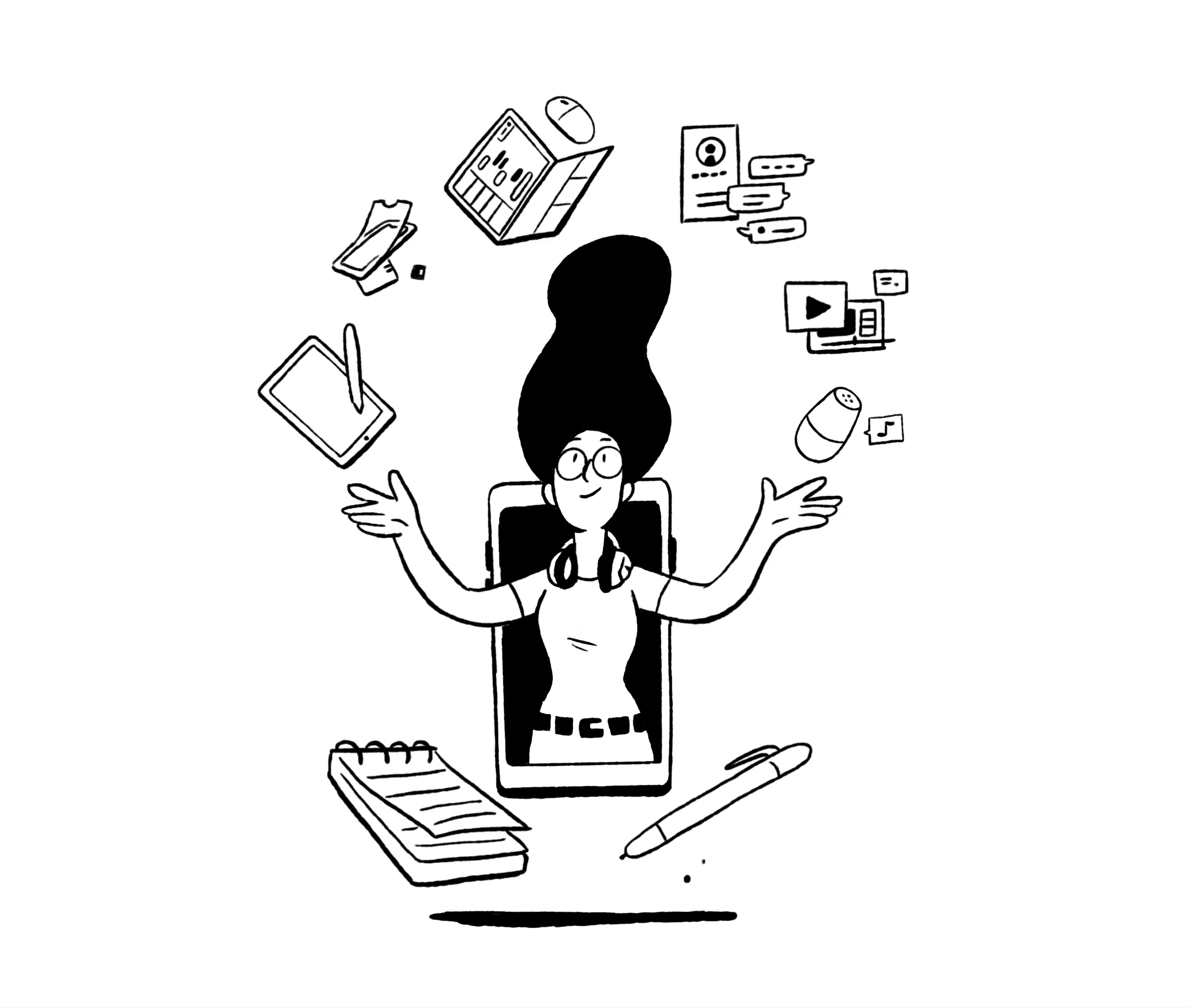
Soluto's goal was to help millions of customers globally to easer unlock the potential of technology - from their family devices to the online services they use. Aiming for an audience this large, we wanted to have a friendly and accessible illustrative design language while also keeping it fresh and not like the common illustration made for high-tech.
We chose an illustrative line with depth that preserves a warmer, more human feel rather than a vector mono-line. That said, we did stick to a black-and-white-only palette that can message a more distant feel, but it helped us to focus our illustrations on the subject (mainly people with
their technology).

One of our big values was to represent the diversity of our clients. We took it to heart and tried to implement it in our illustrations. Creating with only B&W lines was a challenge, but I was more than willing to take it.


Soluto's illustrations didn't stop at that- there was always a fun event to work-up forward to. I illustrated anything from gifts for employees, design elements at holiday parties, and continuing in freebies at big conventions.
Any event requested an alteration in our illustration guidelines to fit the mood and audience.

And of course, let's not forget the tech-


For dessert: colors!
Soluto had a Medium blog, featuring articles about Product, engineering, and design written by its employees. We wanted the blog's visual language to be lighter, aiming towards high-tech employees rather than the main Soluto visual language being more conservative and correct. So of course we wanted to incorporate colors.


